Ready Player One – Cities Of The Imagination
Ready Player One – Cities Of The Imagination
How I made this tribute artwork based on the book “Ready Player One”.
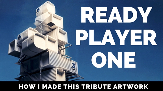
I’m going to show you how I quickly and easily made artwork inspired by the best-selling dystopian science fiction book “Ready Player One” by Ernest Cline. In the book, most people live in squalid cities in “the stacks” prefabricated caravans, crates etc stacked precariously on top of each other. I’m going to make a scene based on this iconic image. The book is also going to be made into a film by Stephen Spielberg so look out for that.
A lot of my art these days is about making cities of the imagination so this little piece fits in quite nicely!
I’m going to use open source software, the 3D application Blender as well as the 2D applications Krita and Gimp. Of course, you can also use commercial software such as 3dsMax and Photoshop too.
I also find modular systems are interesting, previously I was obsessed with Habitat 67 and made some artwork about that too. In today’s cities, space is a premium. Skyscrapers and high risers largely solve this problem.
However, the organic nature of modular stacking has always interested me. How the access amenities such as the stairs and walkways are on the outside such as in Habitat 67 in Montreal.
In Ready Player One by Ernest Cline, the modular dwelling units are largely random caravans and shipping crates, stacked on top of each other.
In my opinion, this dystopian vision is actually quite interesting in an architectonic way in the same way as Los Angeles 2020 in Blade Runner.
So here’s how I made the image…
The Process
1. Photo Reference
It was my final day in Reykjavik, Iceland after a major project in a FabLab Isafjordur (link). I was at the port. This is the main port that brings physical goods to the whole of Iceland. Modular systems were on my mind and I had just seen a book I wanted to read next Ready Player One. Sometimes when we become interested in something, we notice those in real life.
Here are the photo references that I took in the port that will inspire me
2. Quick Concept Sketch
Sometimes you do not need to make a really finished concept sketch. It can be used just to work a few things out such as the components used in the scene. Some sort of initial planning is important as it enables you to focus on what needs to be made without starting to make lots of random models that are not really needed. Yes, I have been guilty of this too! 🙂
Unusually for me in this project, I didn’t make an initial sketch. However, what I did do was write down the minimal amount of models I would need to create and duplicate in order to make the scene look good.
As someone who draws a lot, I would recommend to always draw your ideas at the start. I feel as if I missed out with this part. A brief sketch at the start could have added even more flair to the image!
3. Develop It In 3D Graphics
Just be extruding, edge looping with basic shapes. You can start to make your crates. I only used three types of shape and then stacked them randomly. I also used the place command in Blender to add small cubes and cylinders to give an impression of small details.
Use simple tools such as extrude to add details to each of your modular housing units.
Finish modelling and then layout the minimum amount of models in your scene that you will duplicate to make the complete scene. Little goes a long way by duplicating models.
Nice little features such as these “retro” style floor numbers will add to the scene.
At this point, I suddenly realised I needed stairs for access for the citizens of “the stacks”. Here, I made a simple staircase just from stretching and shifting cubes and cyclinders around and joining them into a single mesh. These stairs were then duplicated and placed intuitively on the stacks.
I then rotated and placed the crates in a haphazard way so as to not look clinical. The final result will give the impression of a dystopian chaos rather than a gleaming new architectural hi-tech edifice. As you can see, just a few simple models can create a detailed and interesting scene.
4. Post Processing
Render before post processing in black and white.
As I have said in the past, I don’t need to reinvent the wheel here. To make your render “sing”, use the techniques outlined in this great video by artist and Blender guru Gleb Alexandrov.
The final render at the start of this blog shows the results of this technique for this Ready Player One scene.
Video
Here is video where I talk more about the 3D scene and the making or this image of “the stacks”
I also managed to get the model into Sketchfab, see below. It may take a while to load though due to the detail.
Going Further
You can now use the techniques here to inspire you to make your own version of “the stacks”. I think that the stacks will become an important icon in the film once it is made.
Also, I love the shape of this structure. I’m going to think about making it into a 3D print and painting it.
Speaking of which, I made this image look nice without texturing it in 3D. Texturing would add hours onto this artwork, the results could look amazing. You could try that too…
How You Can Help Me 🙂
I hope you enjoyed this “Ready Player One” Fan Art post. If you want to say thanks and help me to make mode blog posts in the future.
If you are interested in taking your Cities Of The Imagination, you can take it to the next level, you can buy my Kindle book here about making an imaginary city using Blender, the free 3D graphics application –
Buy my art here on my online shop .
I look forward to talking with you again soon and keep making and creating and I always love to hear how this has helped you and what you have created!


[…] going to show you how I “upgraded” the “Chicken Coin” spaceship and my Ready Player One fan […]